My Seventh Blog Post
Thumbnail Sketches
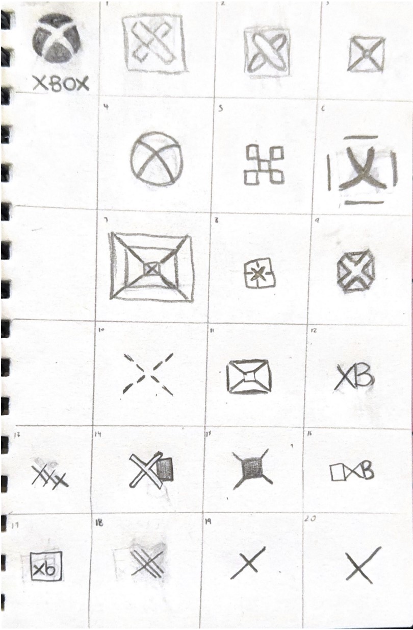
From my 20 thumbnail sketches, I believe the second sketch is the most effective due to its relation with the name of the gaming brand, which is Xbox. The sketch includes a rounded shape overlapping the same one in the form of the letter x, with a box outlined around it, signifying an x in a box. The soft composition of the rounded x shape, is intentionally implemented, constrasting with the sharpness of the box around it.
45 Thumbnail Sketches
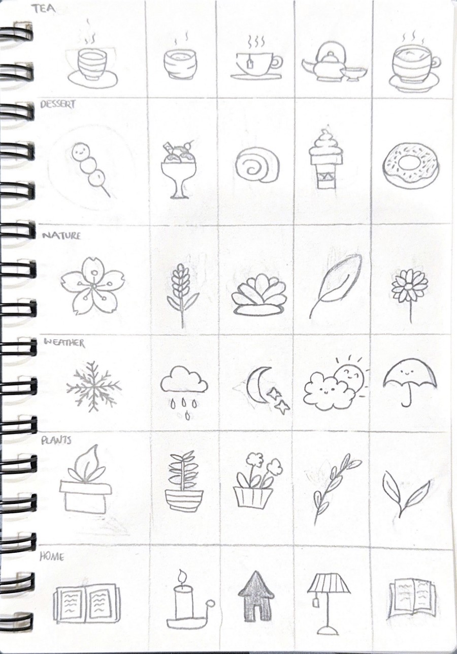
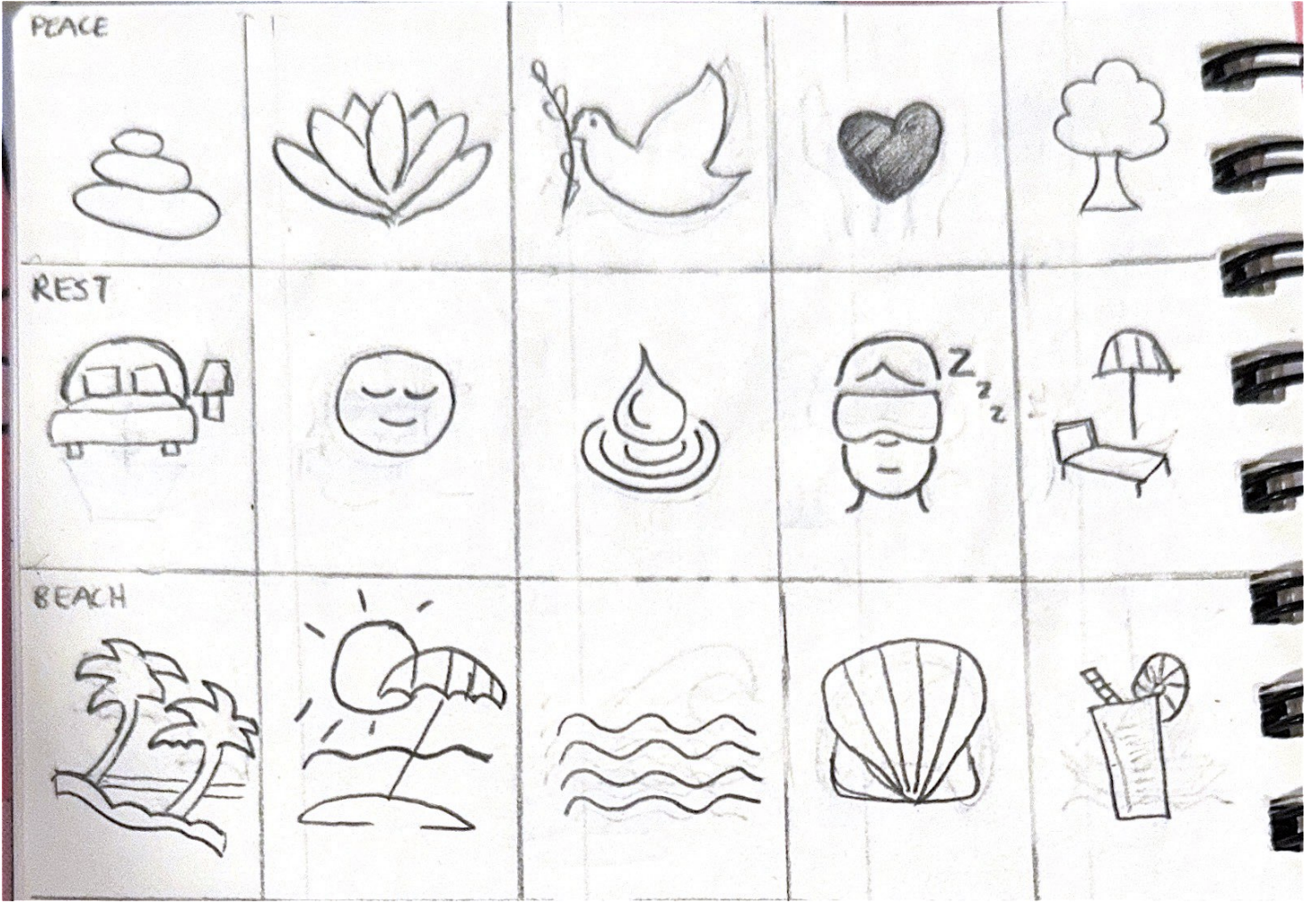
My icon design sub themes include, tea, dessert, nature, weather, plants, home, peace, rest and home, which reflect the theme of calm. For tea I have chosen the fourth icon which includes a tea pot and teacup, symbolising the calm nature of drinking tea. For dessert I have chosen the first icon, dango, a japanese dessert with three colours. Pink meaning cherry blossoms, white meaning full bloom and green the leaf of the blossoms. For nature the Sakura icon symbolises new life and the soft colour relates back to calm. For weather the second icon, rain represents the tranquil sentiment of rain. For plants the third icon, a flower pot, implies the delicate growth of plants and the calmness of it. For home the fourth icon, a lamp, is sometimes a safe haven as it creates a soft ambient touch to any room which is relaxing. For peace the second icon, a lotus, is a symbol of peace and purity. For rest I changed to a book icon as reading allows one to relax and take rest immersed in the words of their novel. Lastly for beach I have chosen the fourth icon, a shell, which reminded me of the peacefulness in searching for a beautiful shell and admiring its delicate patterns. In terms of the elements of design, each icon is intended to feature less outline with the softness of the colour palette being mainly displayed without any edges, particulalry rounded in shape, in order to bring out the calm aspects of my icons.